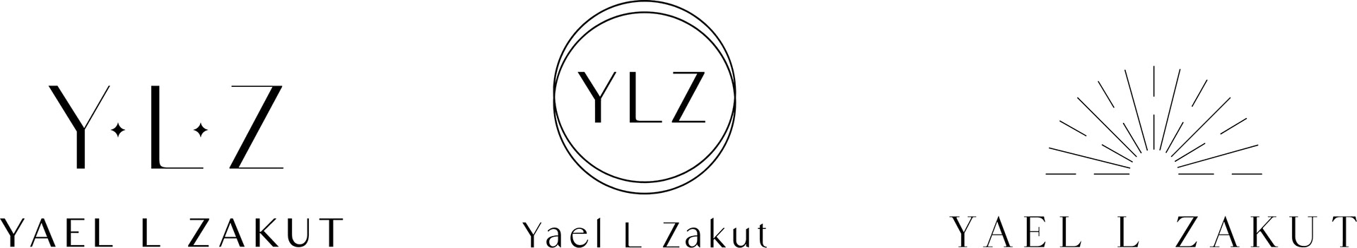
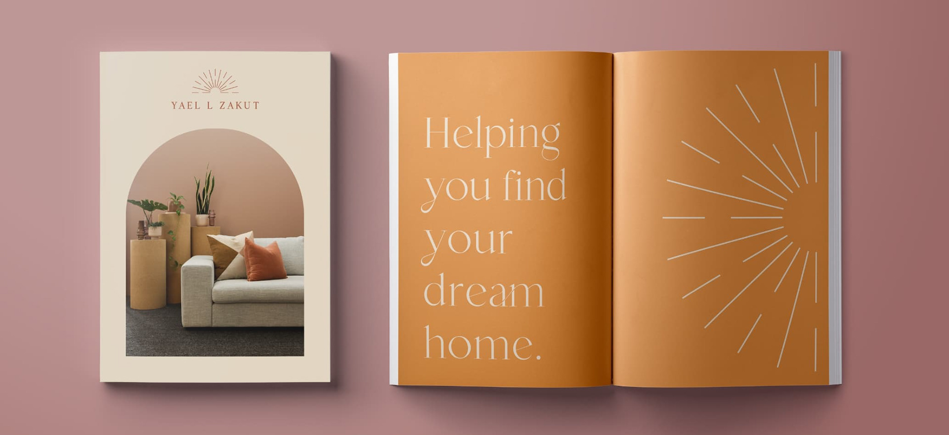
The agent was drawn most towards the sun imagery in the third logo option as well as the lighter serif type. At the conclusion of the logo design process, I decided to expand the brand system as a personal project. I was inspired by the spiritual and natural element of the logo and use that as the basis for the branding.

MOODBOARD
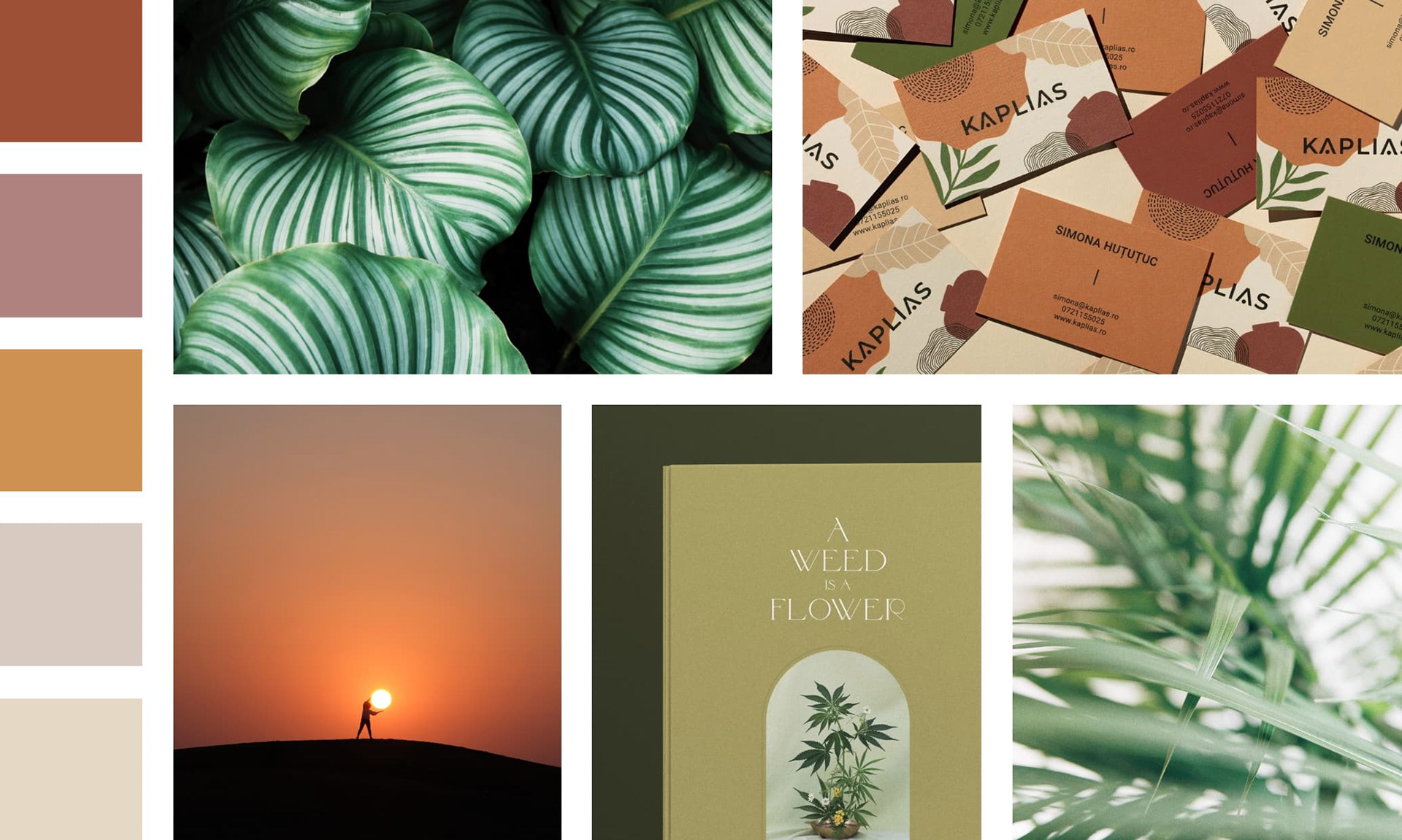
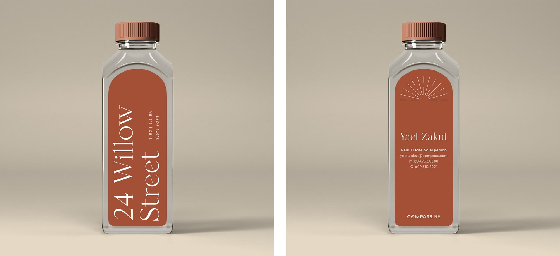
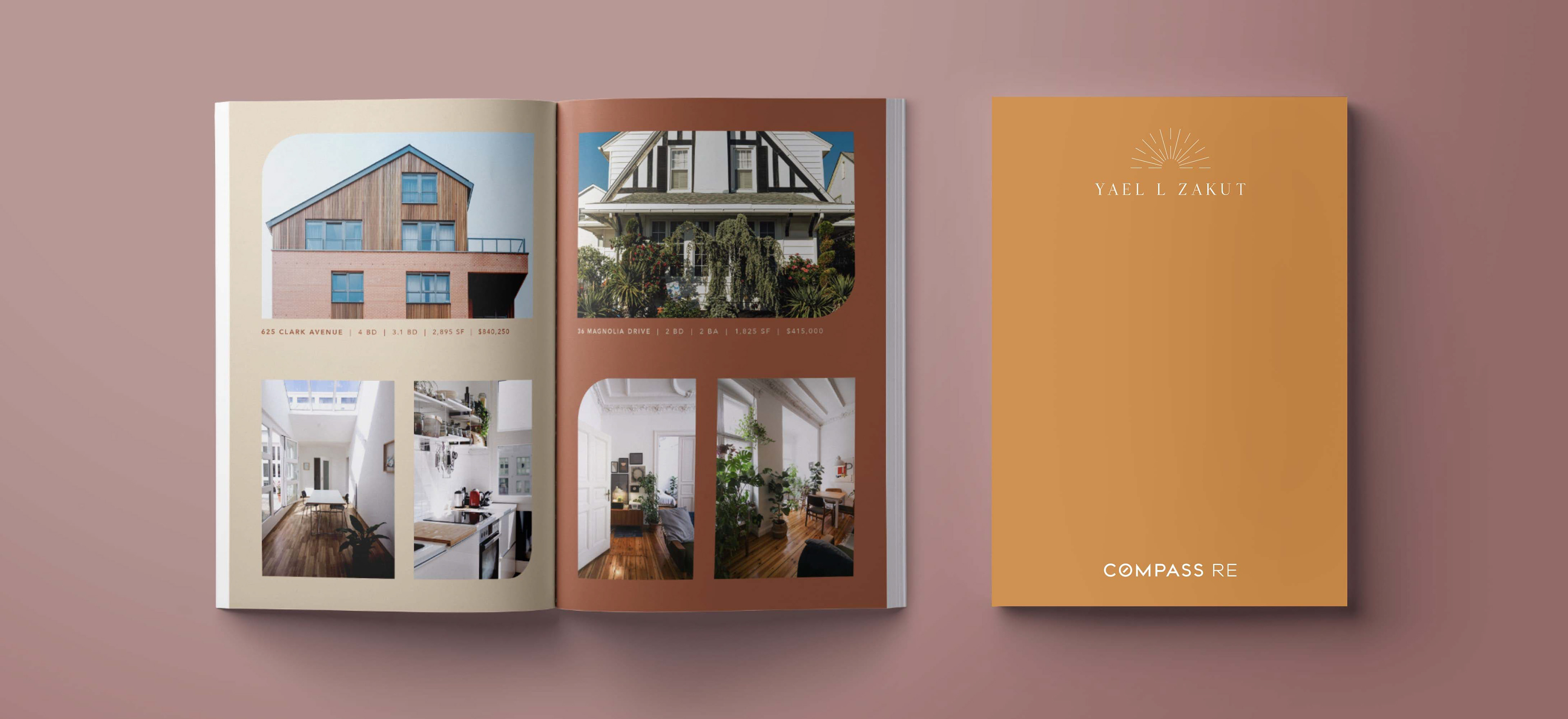
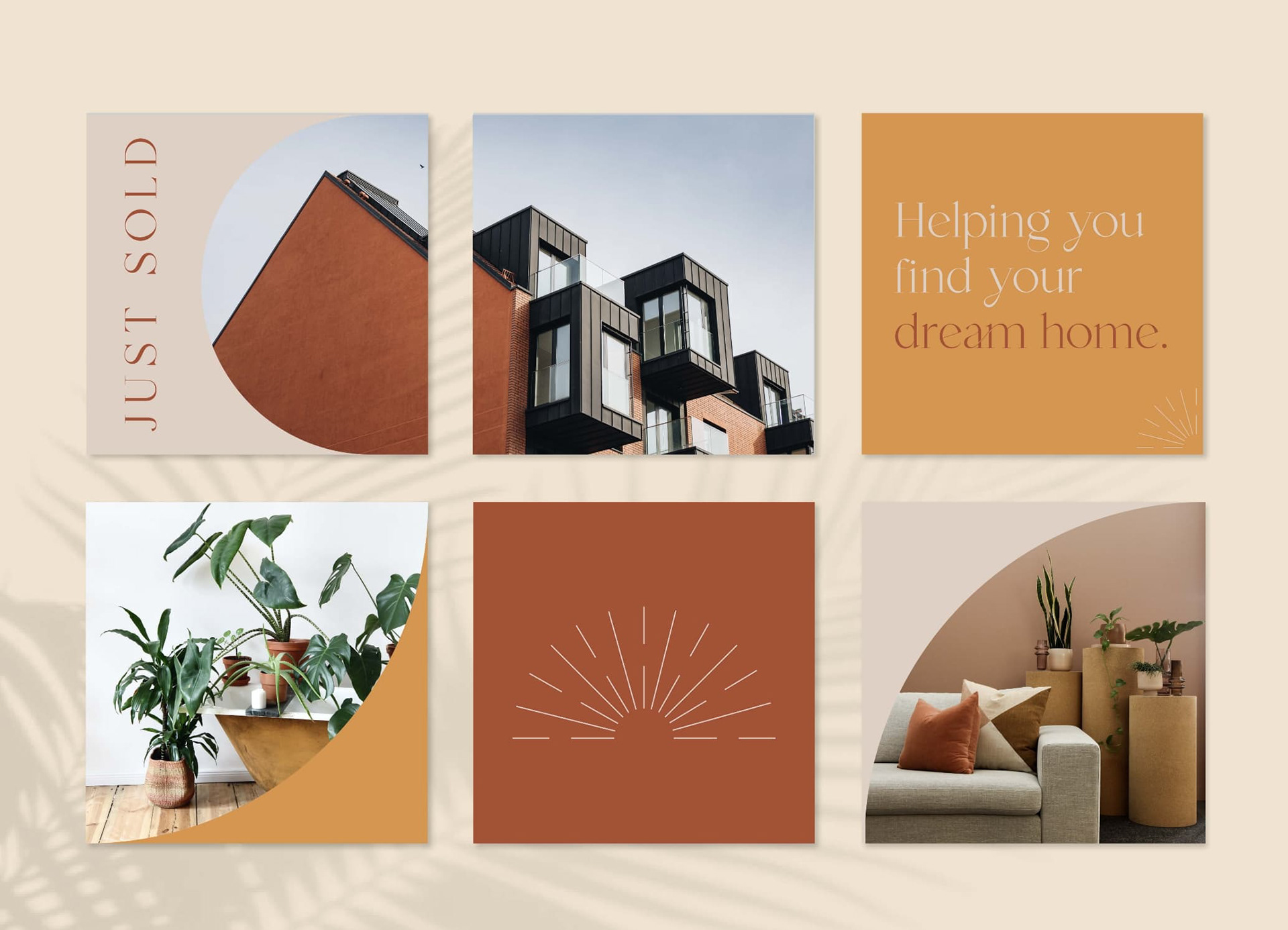
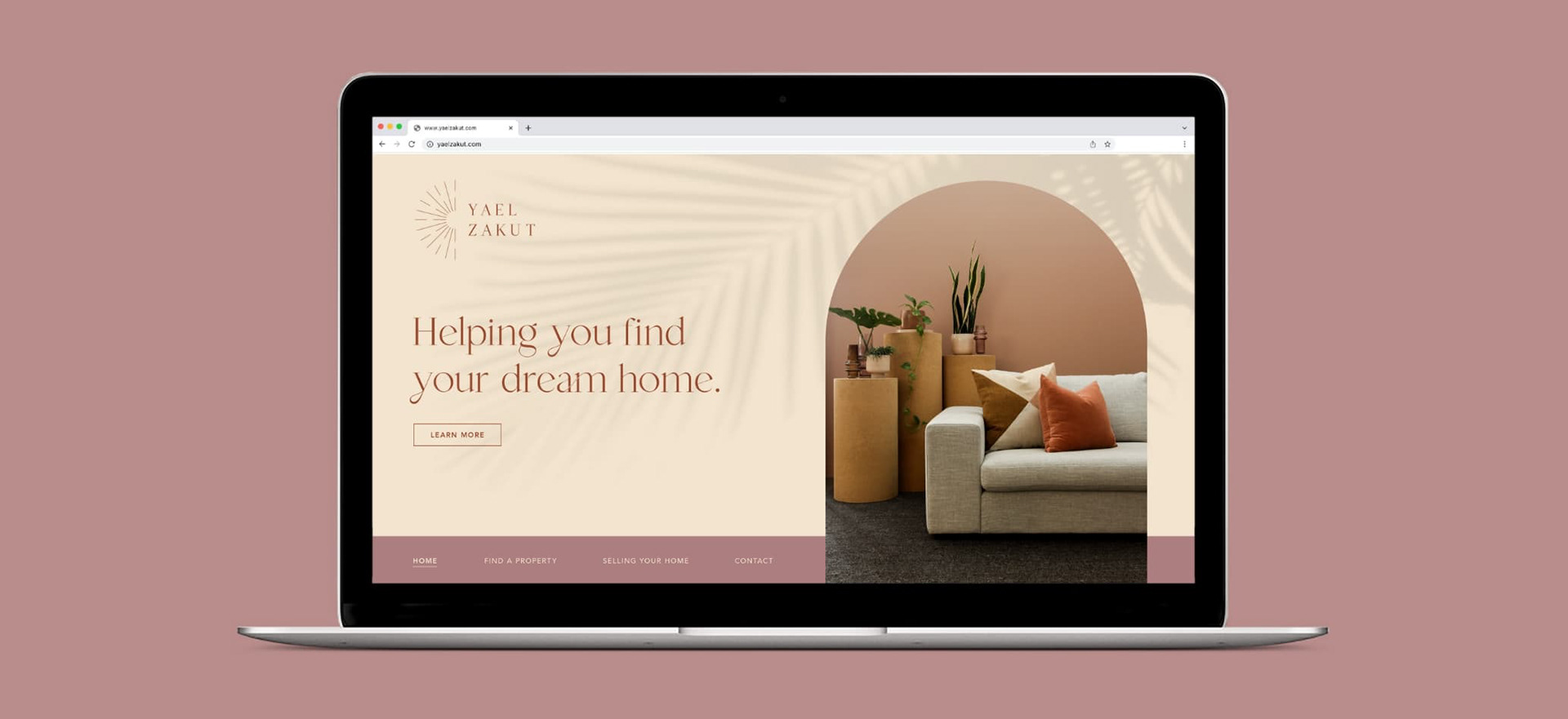
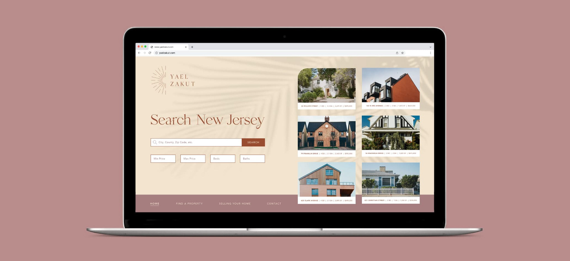
The design executions use a lot of warm blocks of color which are broken up by cooler green plant photography and arch details. Arches and rounded edges are prominent in nature as well as in architecture, which ties back to the initial logo design and inspiration.
Collateral
INSTAGRAM GRID
WEBSITE
WATER BOTTLE