
Logo

The first step in this process was gathering information from people living with these disorders through a survey that I created. This information allowed me to pick specific talking points as well as visuals to feature in the campaign deliverables. I decided to focus on clinical depression and schizophrenia based on personal experience as well as feedback I was receiving that both disorders were frequently misunderstood by the public.
Booklets
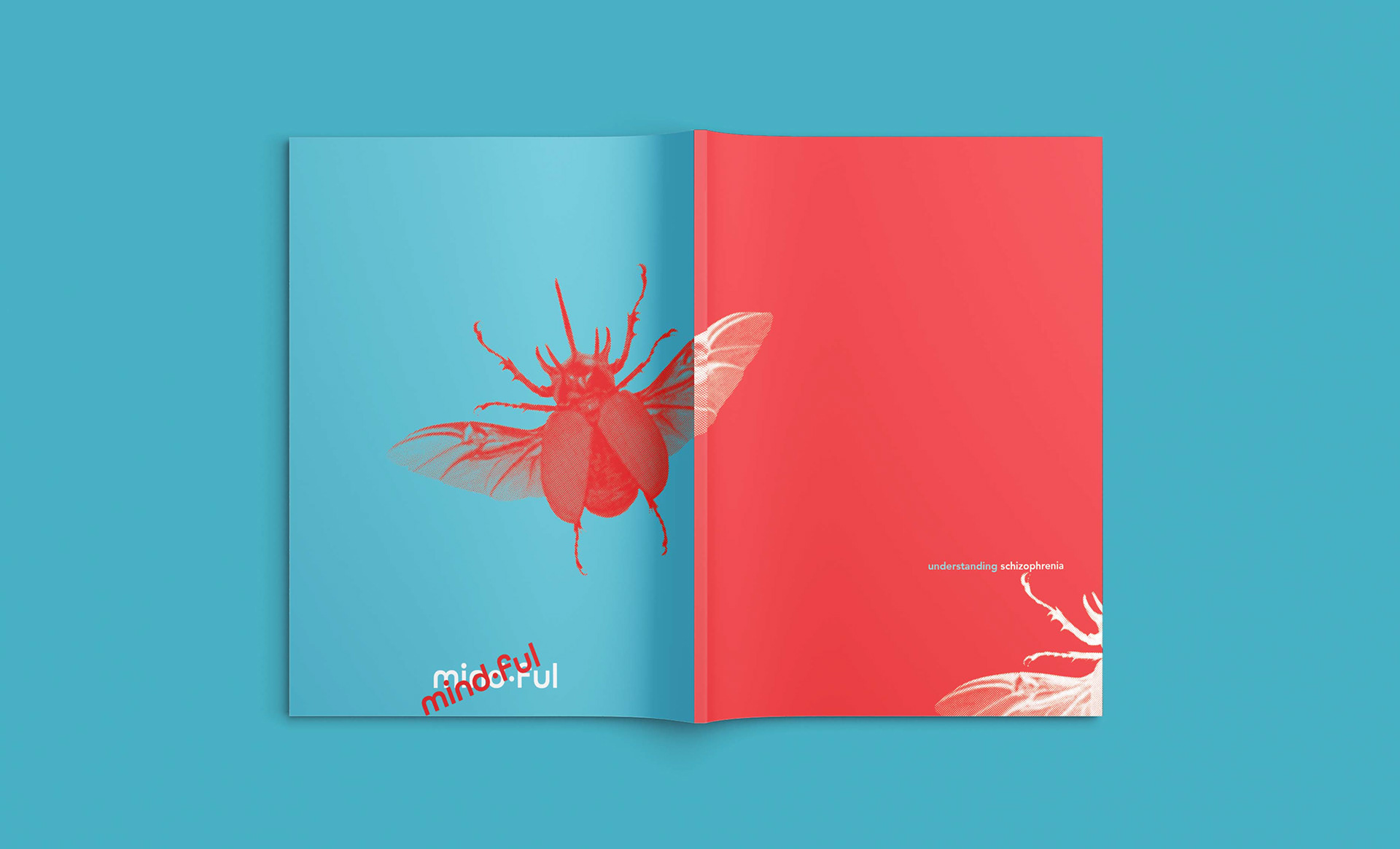
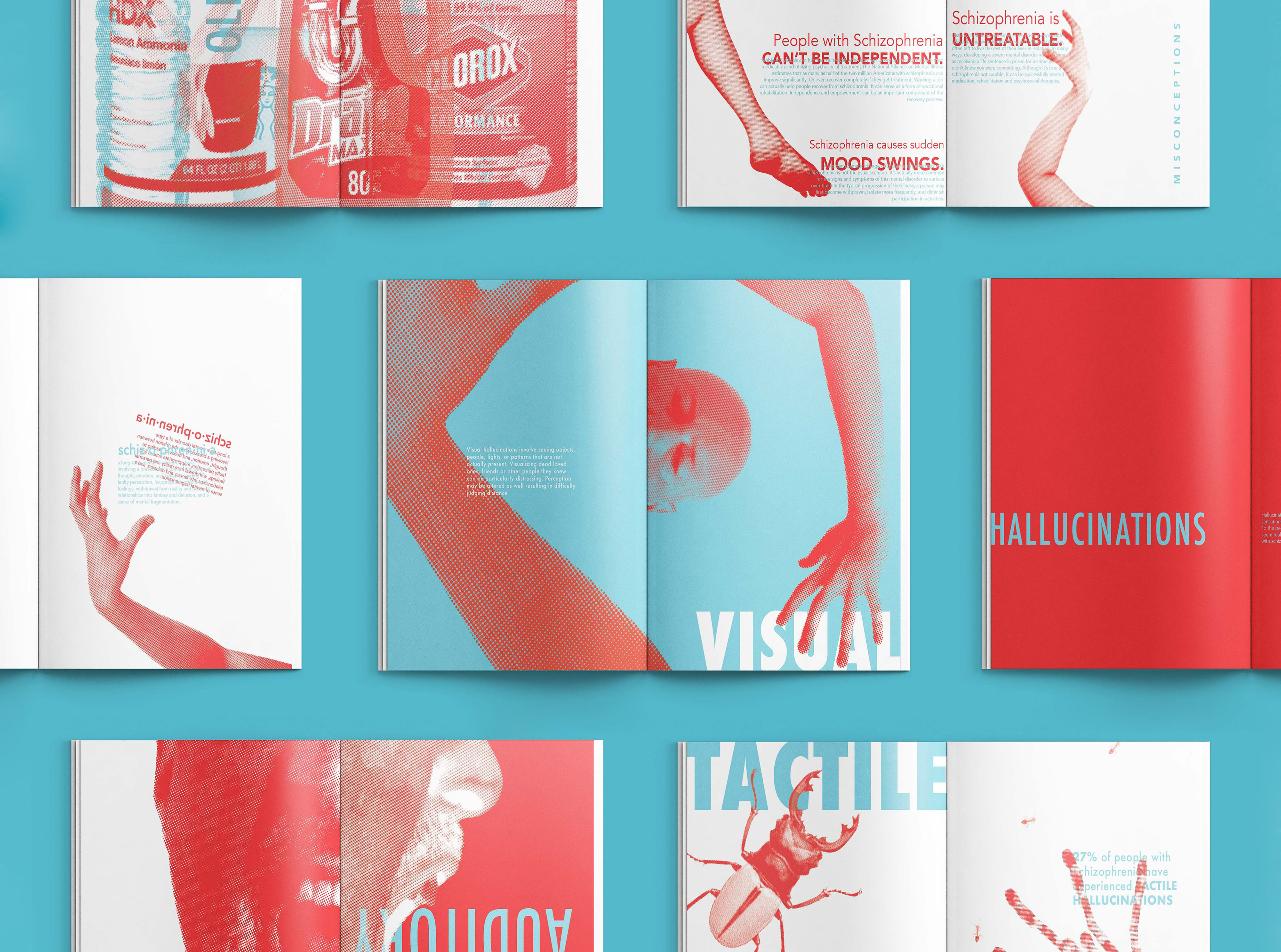
When researching schizophrenia, there was a pattern of not being to distinguish between reality and delusions. These delusions were common for all senses and could cause people living with this disorder to become overwhelmed, disoriented and paranoid. I decided to use a contrasting blue and red color palette in addition to overlapping elements to create a similar sensation for the viewer. For the booklets, I chose a paper that felt like skin to create an uncomfortable tactile experience, much like tactile schizophrenia delusions.

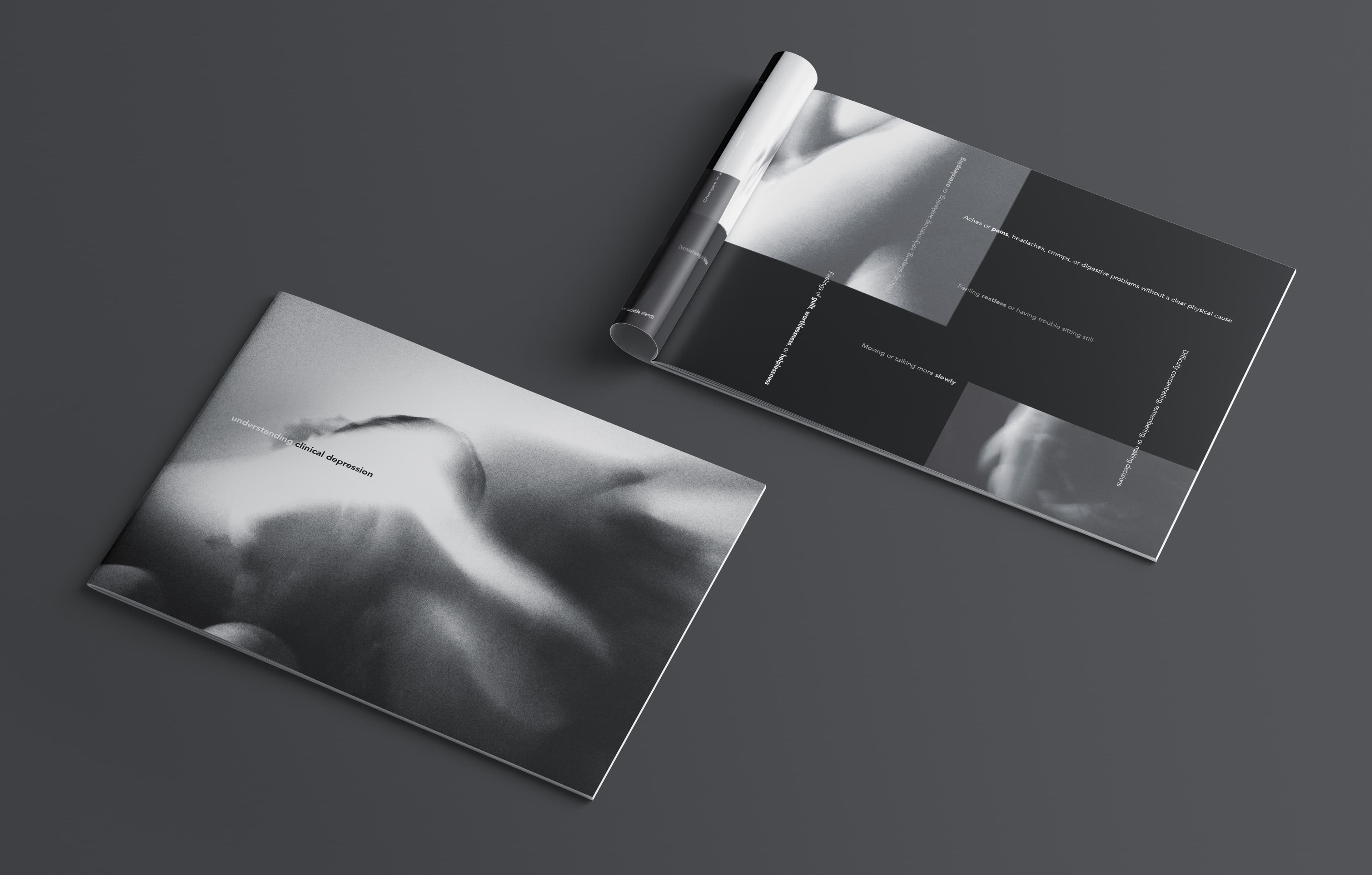
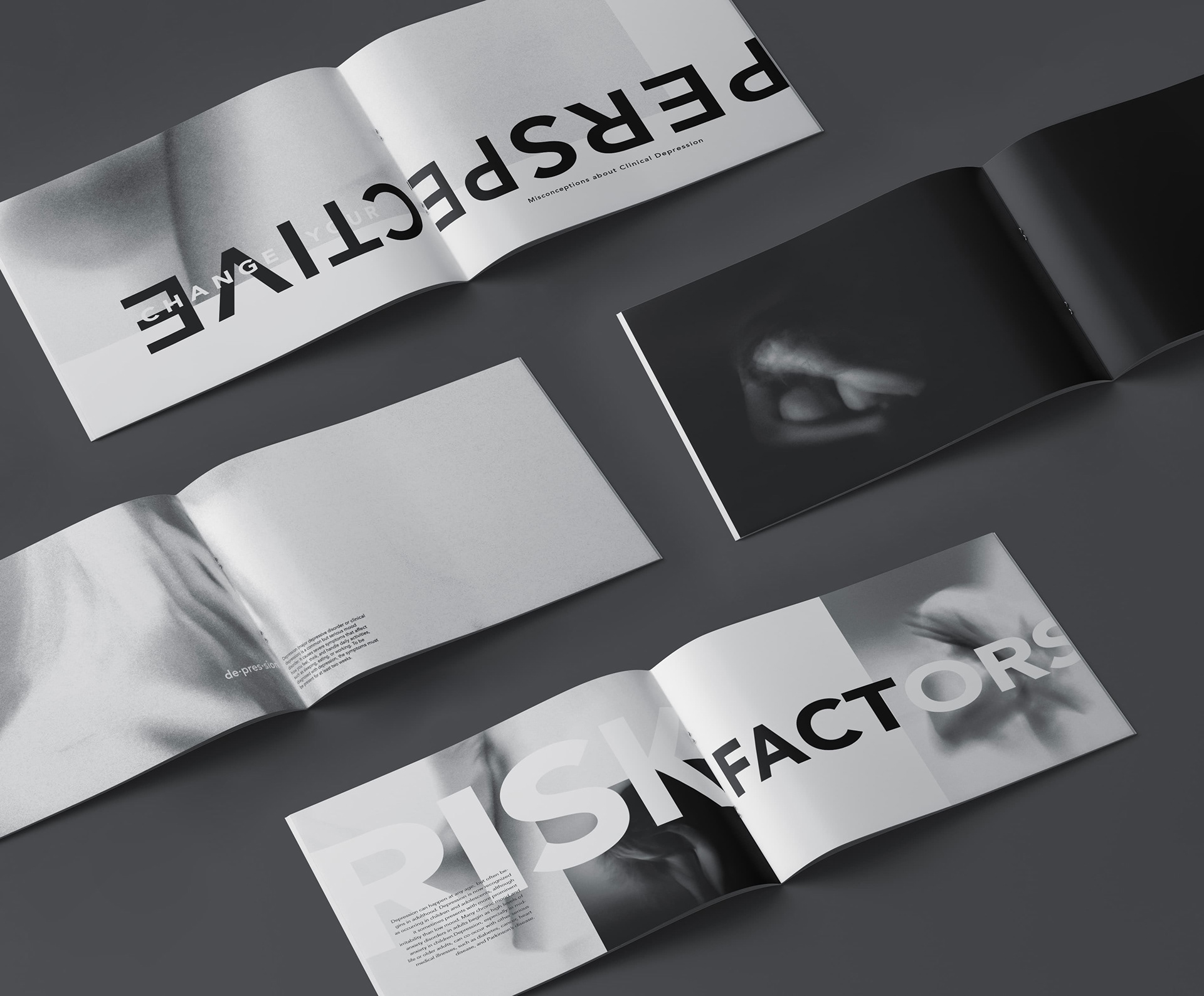
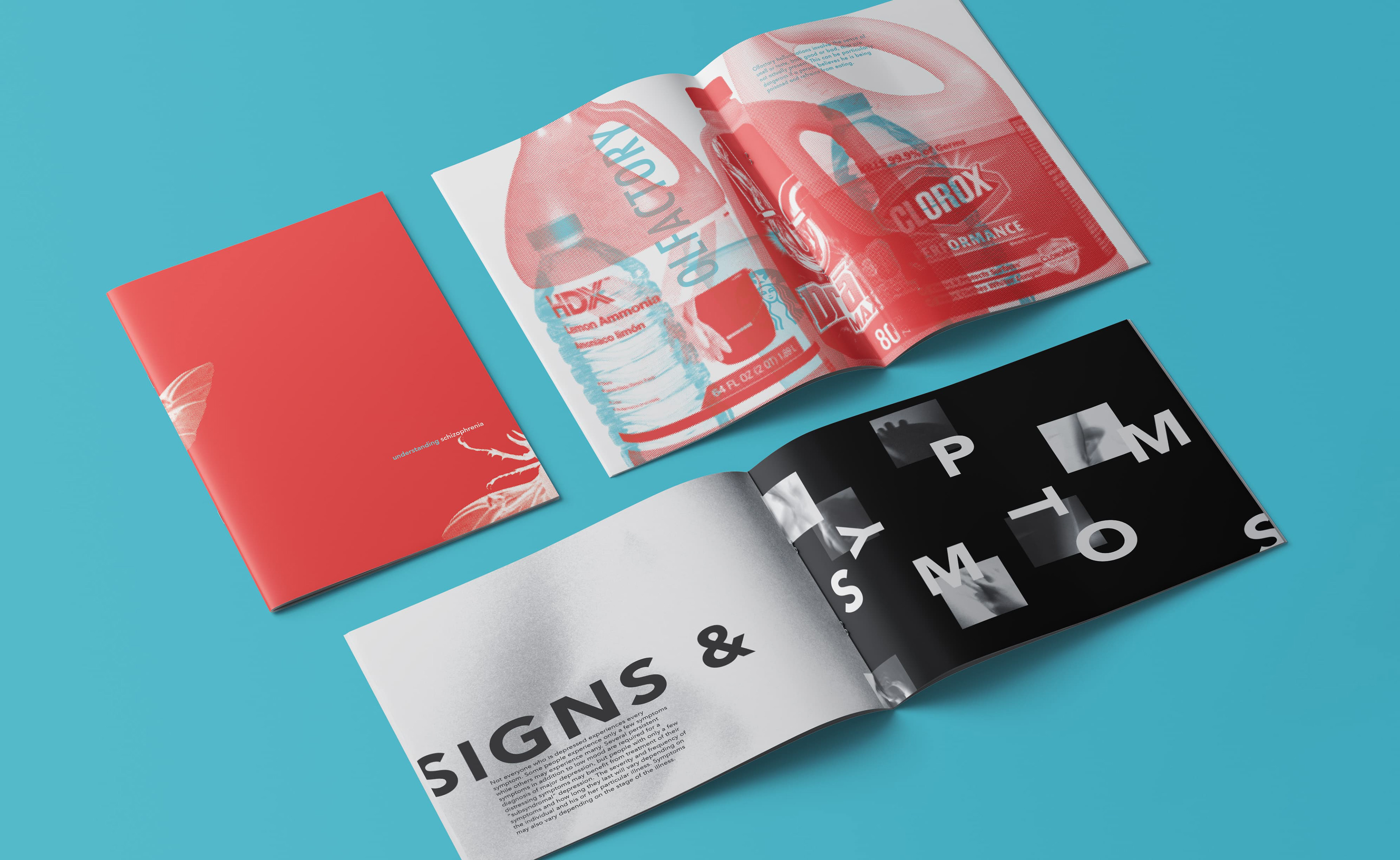
For the depression visuals, I used a muted grey color palette. For the photography, I decided to take blurred long-exposure photos of myself to show symptoms such as disassociation, decreased energy levels, and bodily discomfort. The goal was to keep the imagery abstract while still allowing the reader to understand the body movements. The typography plays off of the photos and often overlaps with them making readability challenging at times, much like how people living with depression have trouble focusing on and comprehending their thoughts.